Scroll down to view project
01
The Sacred Space
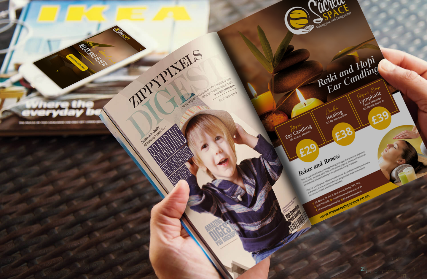
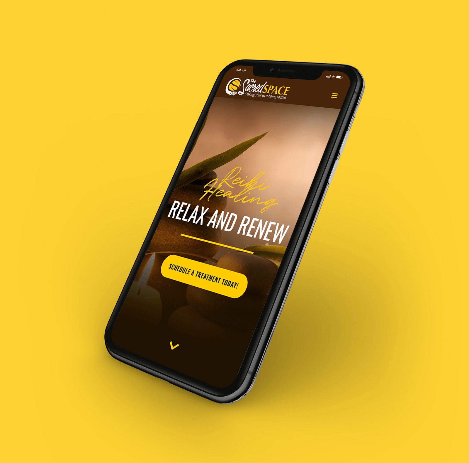
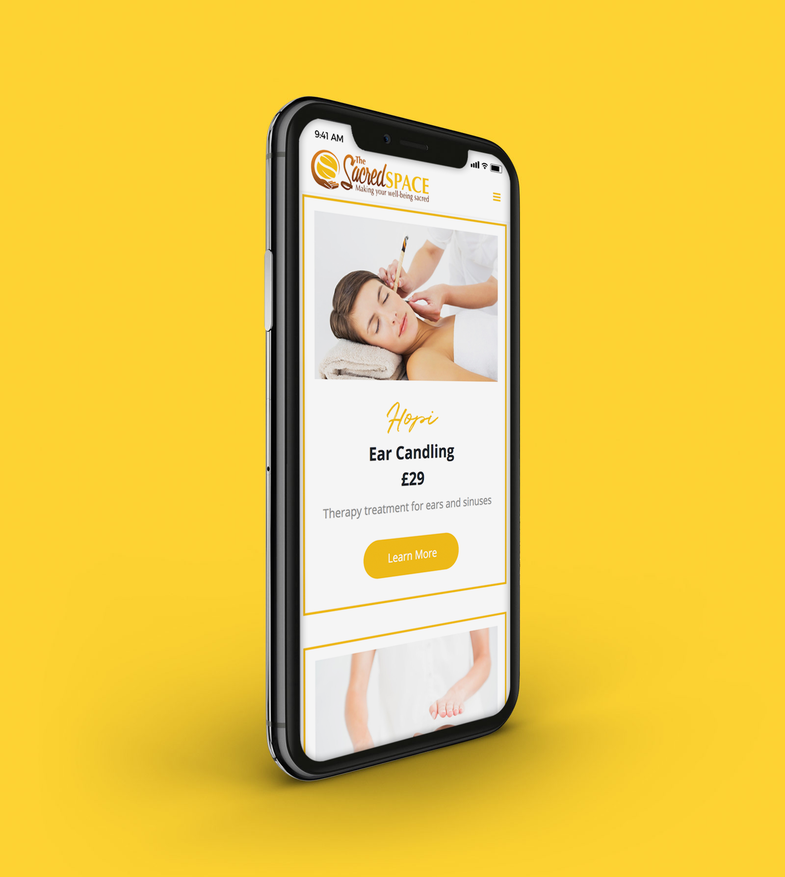
Located in Derby, England, The Sacred Space is a new business specializing in Reiki Healing. They offer complementary therapies that are used to heal, rebalance, re-energize and reconnect your body, mind, emotions and spirit. A look and feel that communicates hope, friendliness and warmth was needed to launch the company brand.
02
The Goal
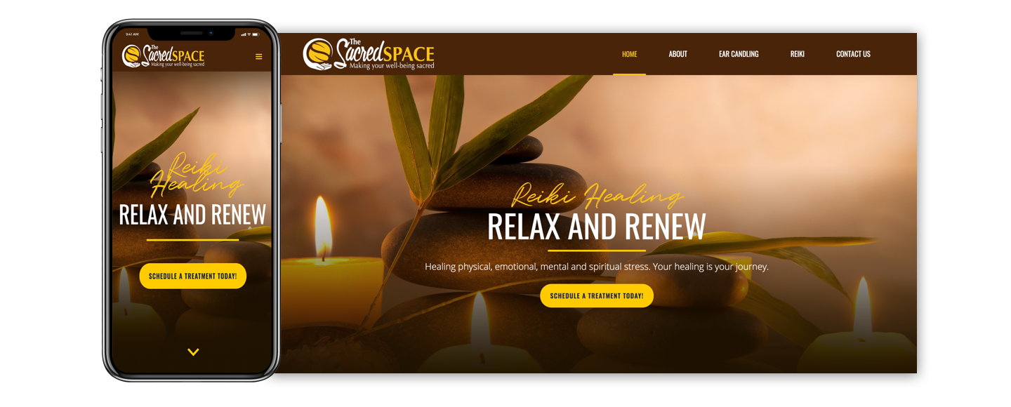
The client needed a simple, clean, one-page website to market their services. The company's primary focus was to develop an online presence that would target a demographic looking for a unique type of healing that goes deep within the mind. Along with a new website, the client also needed a couple of branded marketing collateral.

03
Logo Identity
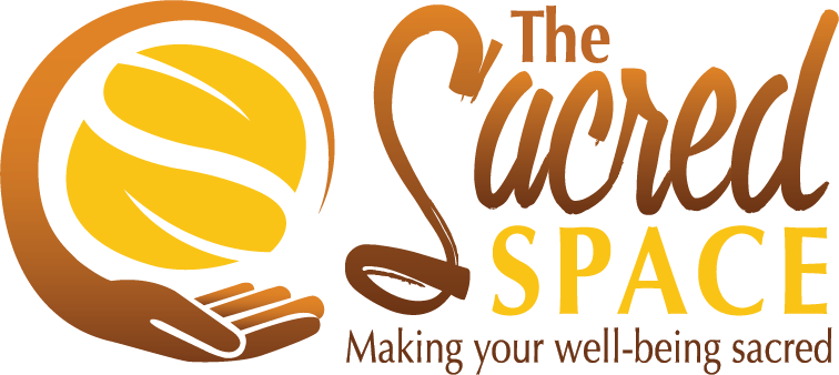
Hands represent “energy” in which Reiki energy flows from the practitioner’s hands. The Ying Yang symbol represents energetic healing and balance: Replacing negative change with positive change.
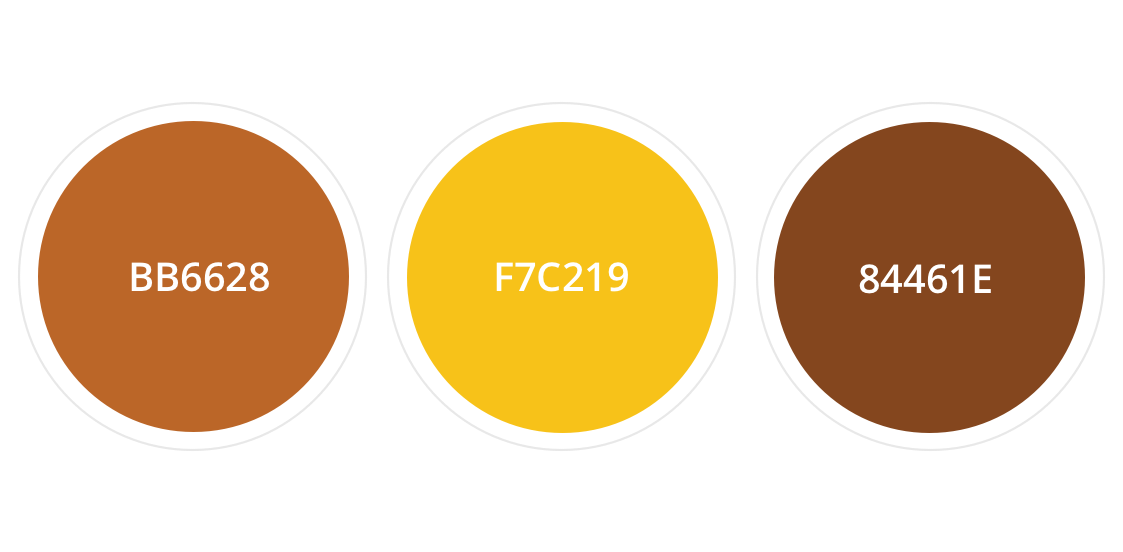
04
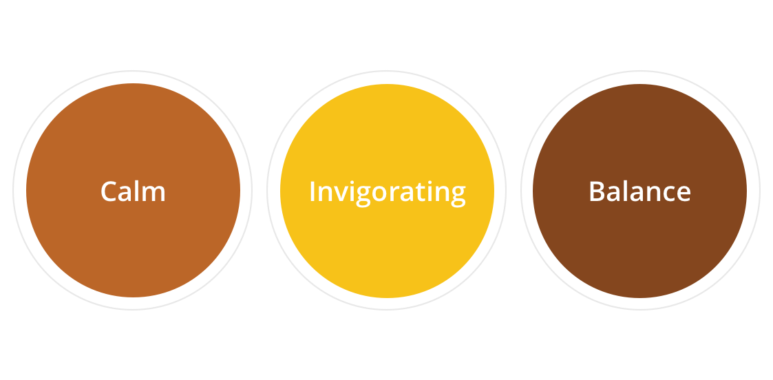
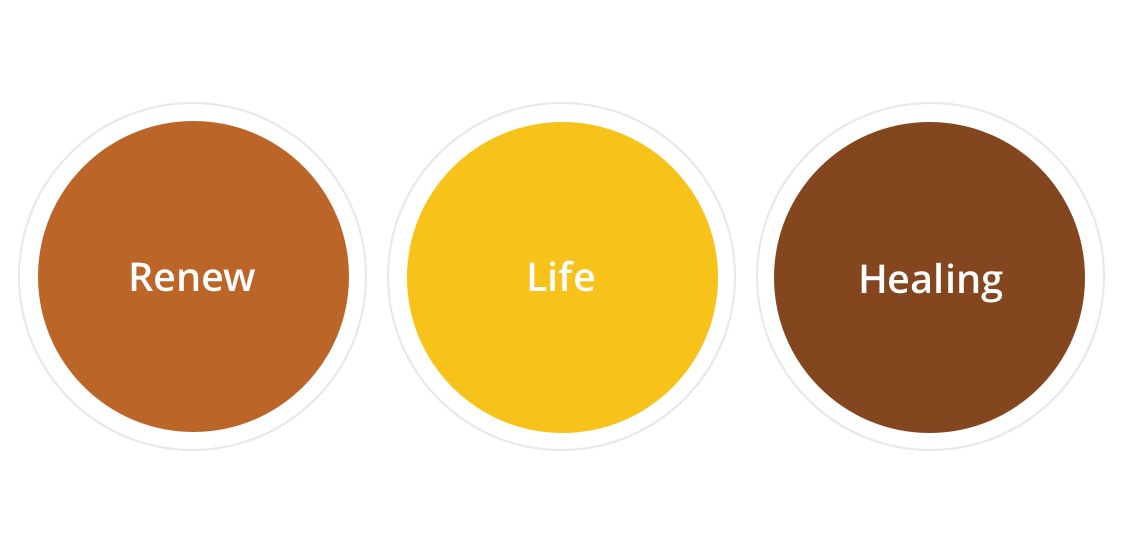
Color Palette
A brown color palette was used to capture the warm feeling of the brand. To represent energy, positivity, happiness and freshness, a deep vibrant yellow/gold tone was added to offset the earth tones.
05
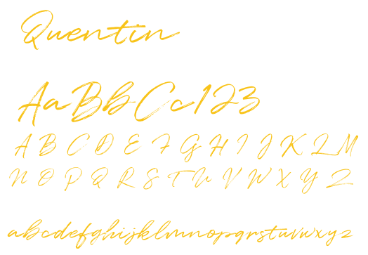
Typography