Project Overview
NOTE: This project was created during my employment at Globalsource IT
OptimizeHC is (was) a staff augmentation company specializing in serving the dynamic need for consultants across the Health Care industry in the U.S. OHC was established to serve as a single source for many healthcare IT positions. Although the company didn’t achieve much success within the IT consulting staffing industry, creating the brand identity throughout the design process was a fun journey.
My Role
I was the Lead Designer on the OHC project while working under the direction of the Marketing Director. While collaborating and exploring ideas, creating the brand was a full collaborative team effort.
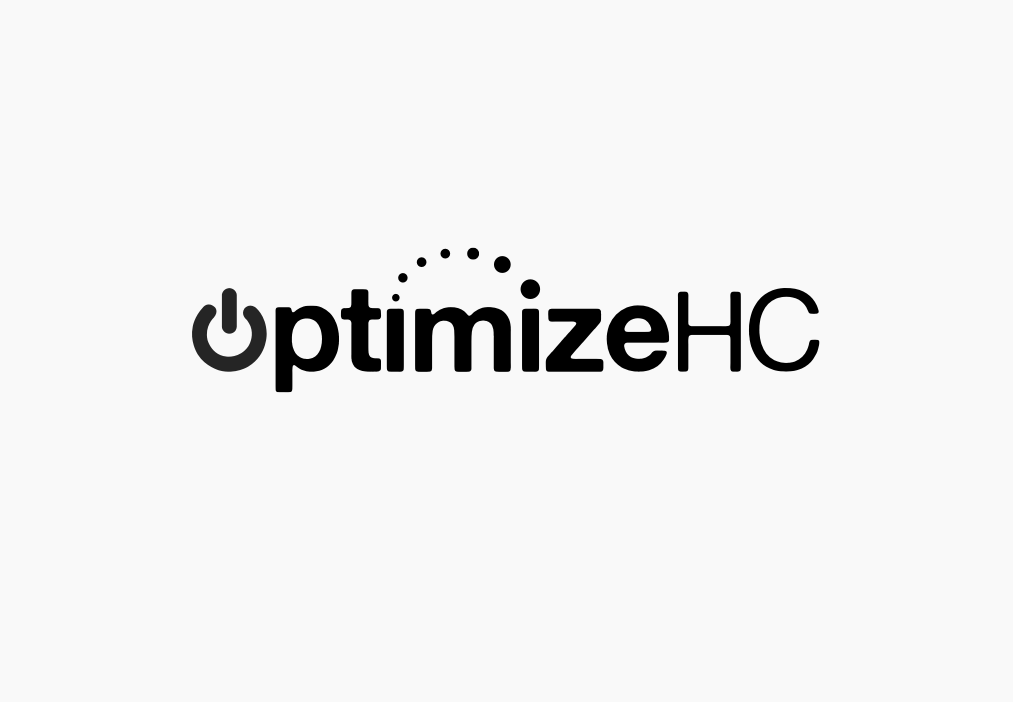
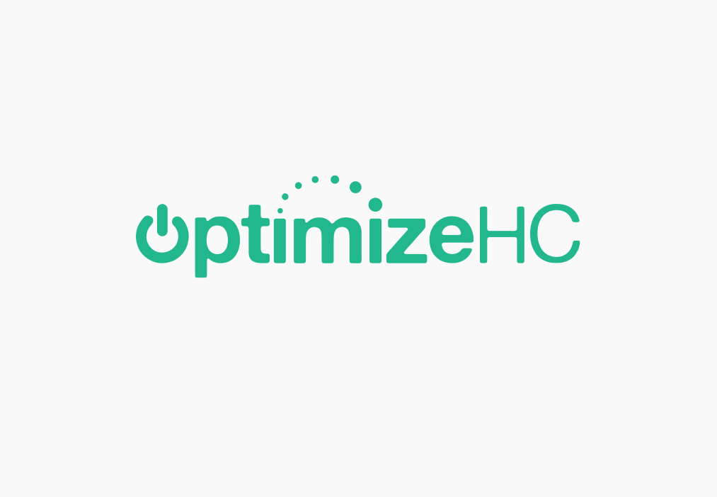
Behind the Logo
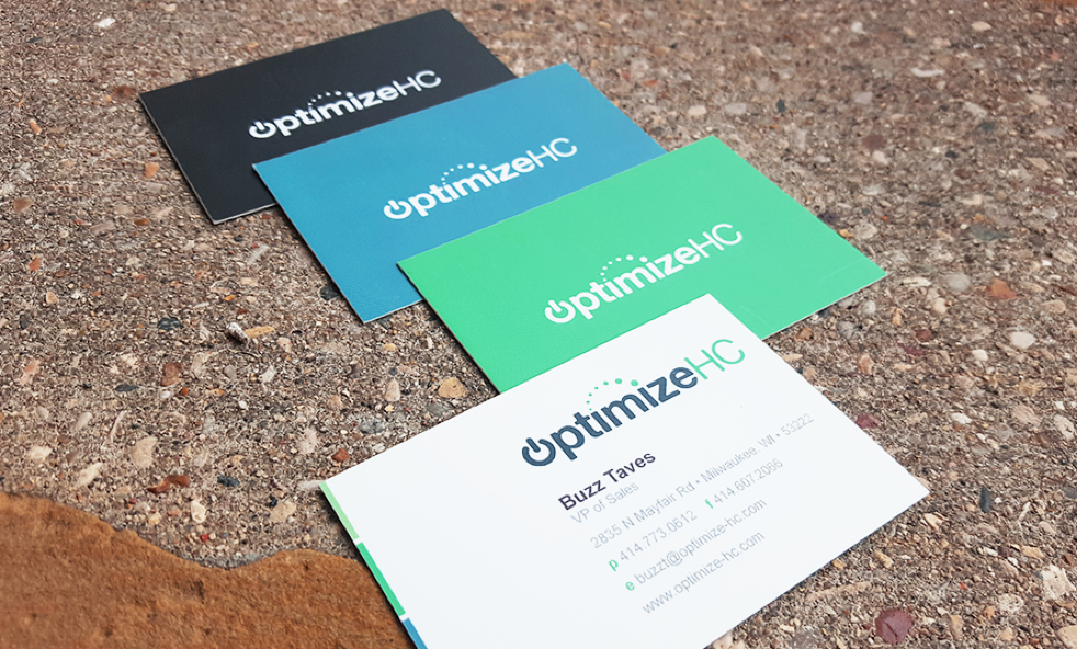
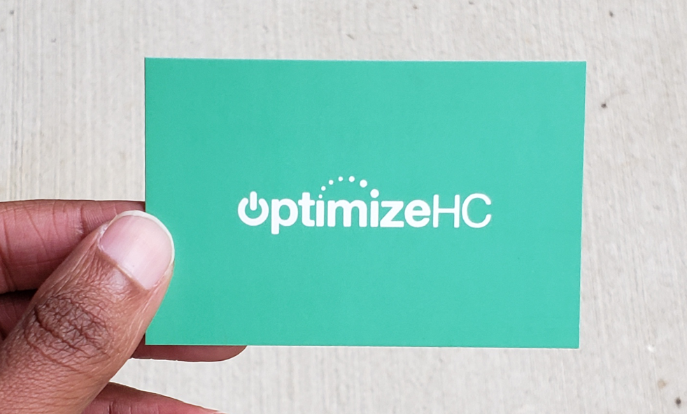
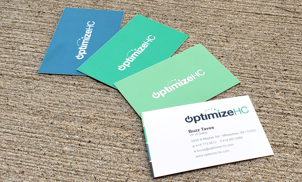
The primary focus of OptimizeHC was helping healthcare companies find the best niche IT talent with specific technical skills. As the design team, we knew that we wanted to keep technology in mind during the design process to market the company’s services to the technical industry. Start and connect was the meaning we wanted to develop behind OptimizeHC. So we incorporated a “power” button icon as the letter O to symbolize power-on and the dots to express “connectivity.”
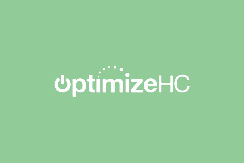
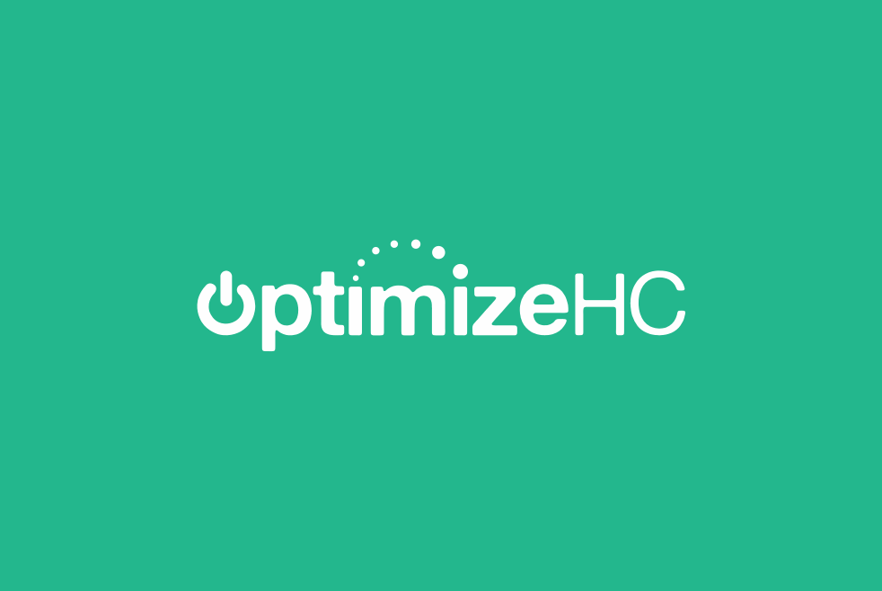
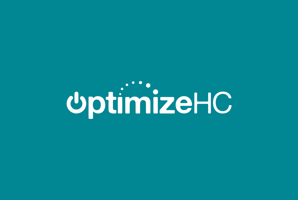
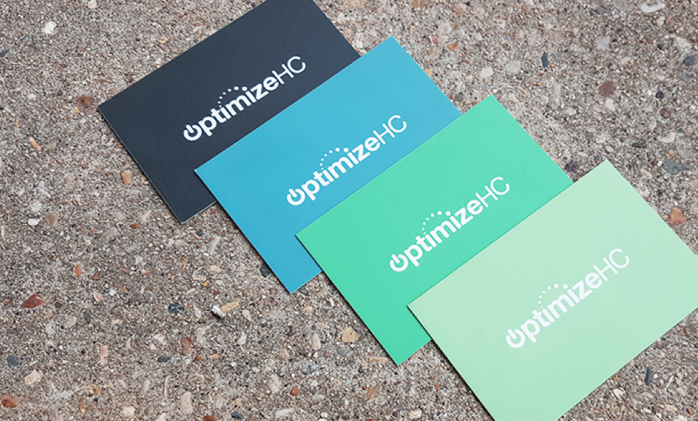
Color Exploration
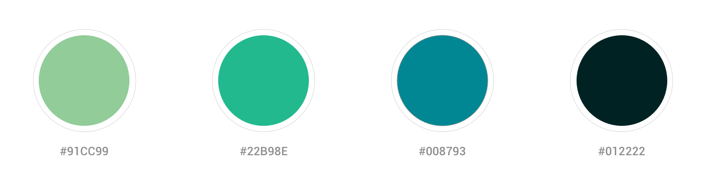
Initially, the Marketing Director and myself intended on sticking to a deep green-blue color scheme or a typical teal/blue color that is commonly represented in the healthcare industry. We then explored other color options (that complimented the original teal color) to push the brand further creatively.
Color Palette
Icon Mark

Logo

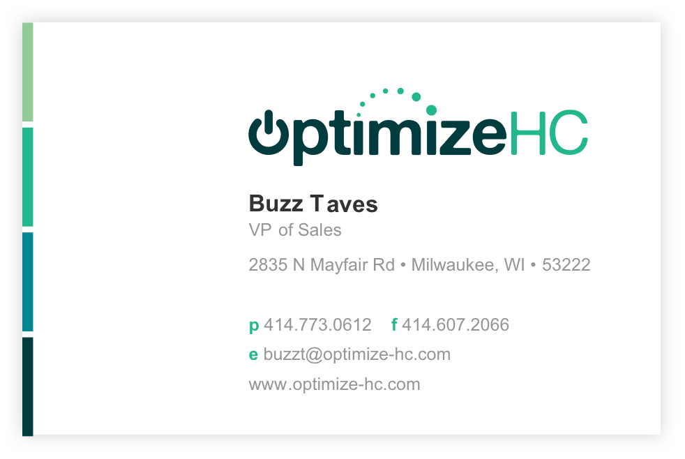
Business Cards