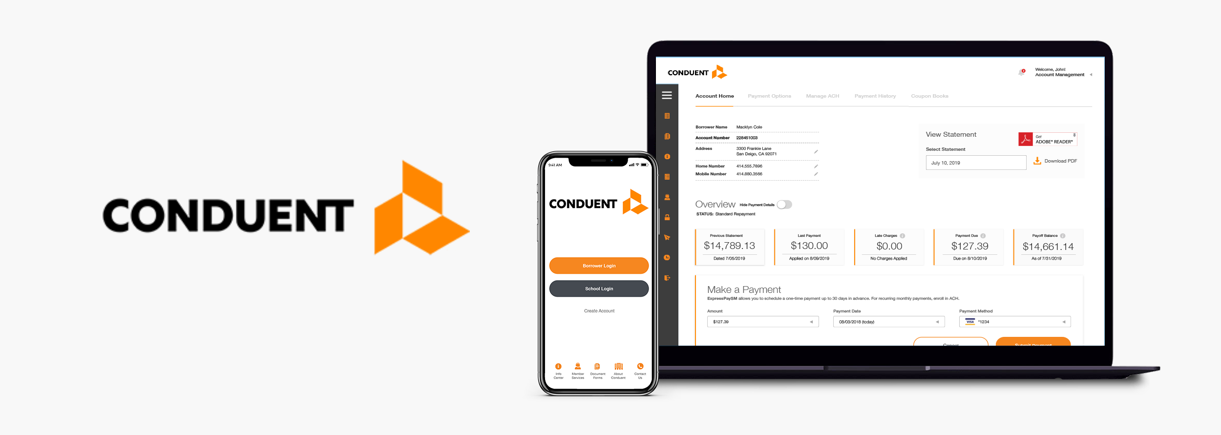
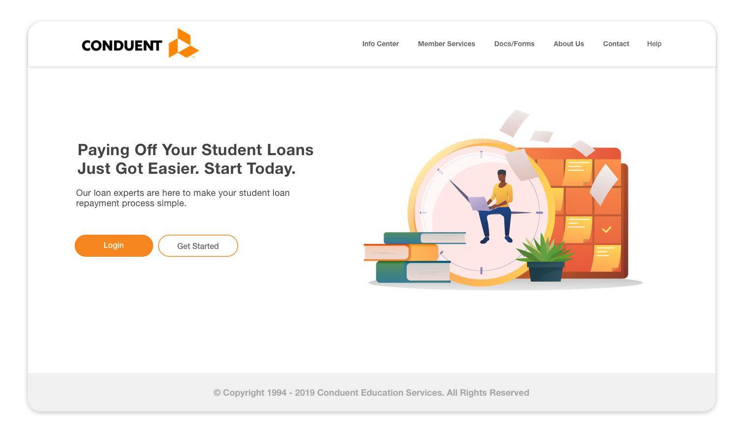
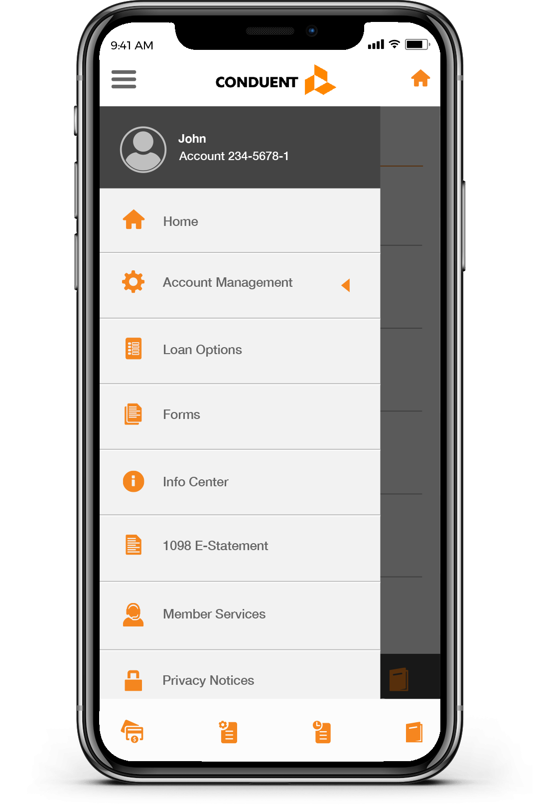
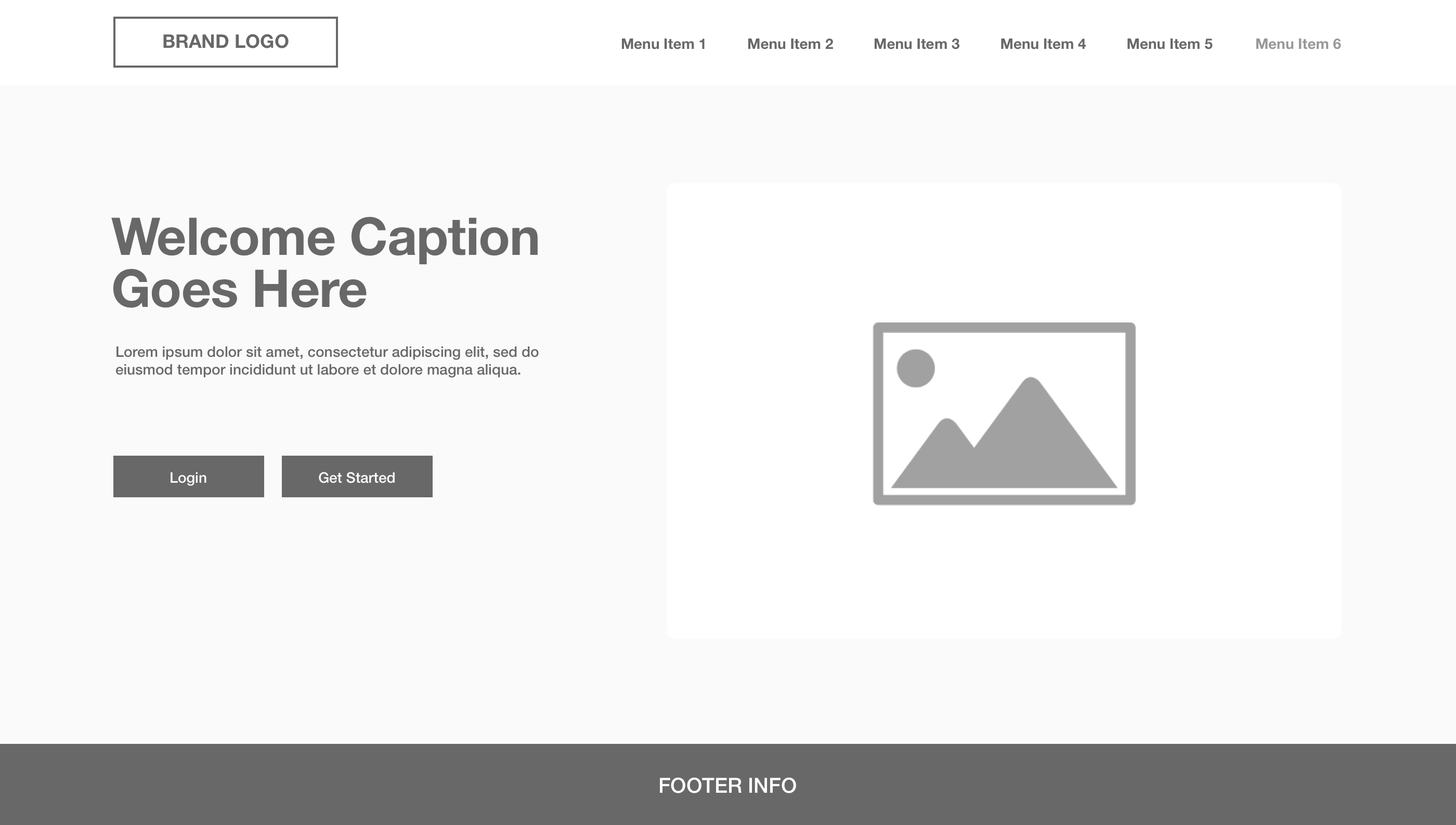
In this bare bones structure, I've given the login area more of a top priority on the home page design. Main navigation has also been placed at the top of the page. My thought process was to keep the home layout simple and think user experience first.
Home - Wireframe Concept
In this bare bones structure, I've given the login area more of a top priority on the home page design. Main navigation has also been placed at the top of the page. My thought process was to keep the home layout simple and think user experience first. I've placed the quick links into a dedicated toggle slide-out menu which can now take a lower priority on the page.
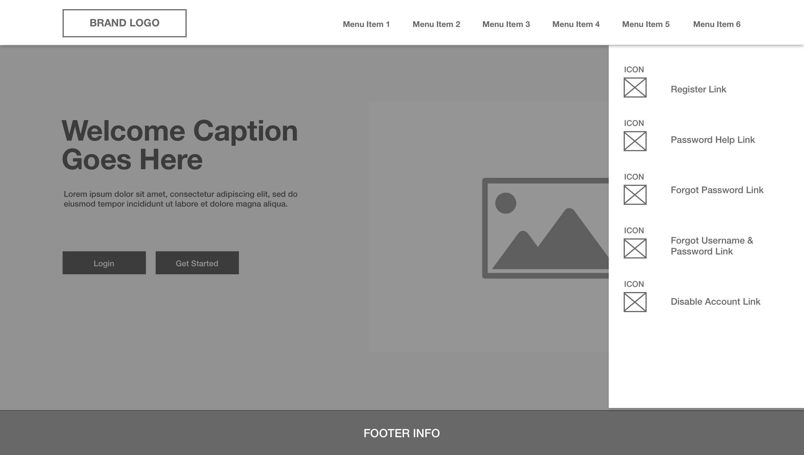
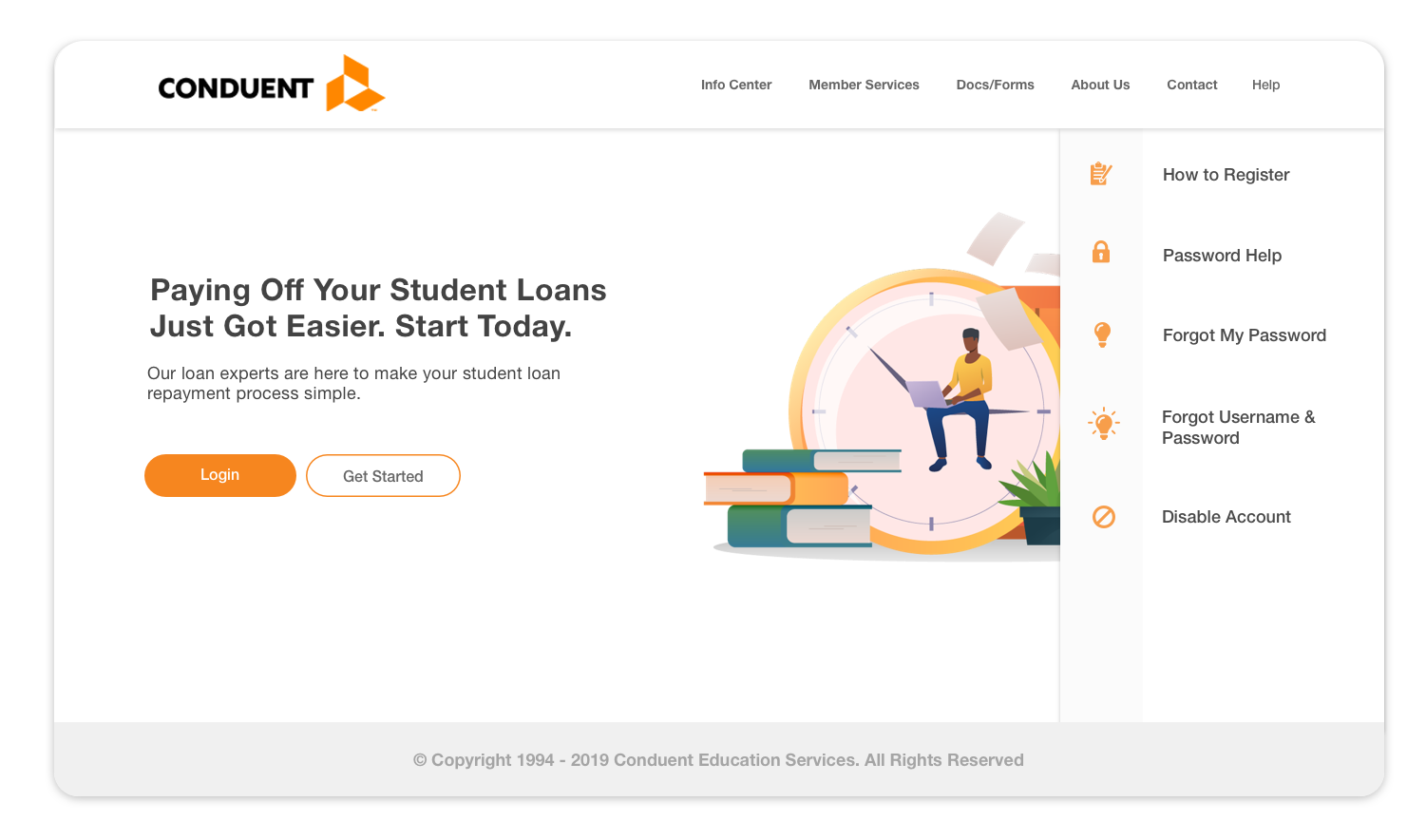
Quick Links Area - Wireframe
I've placed the quick links into a dedicated toggle slide-out menu which can now take a lower priority on the page
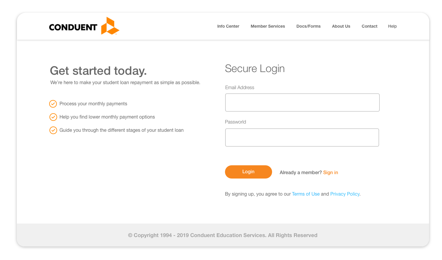
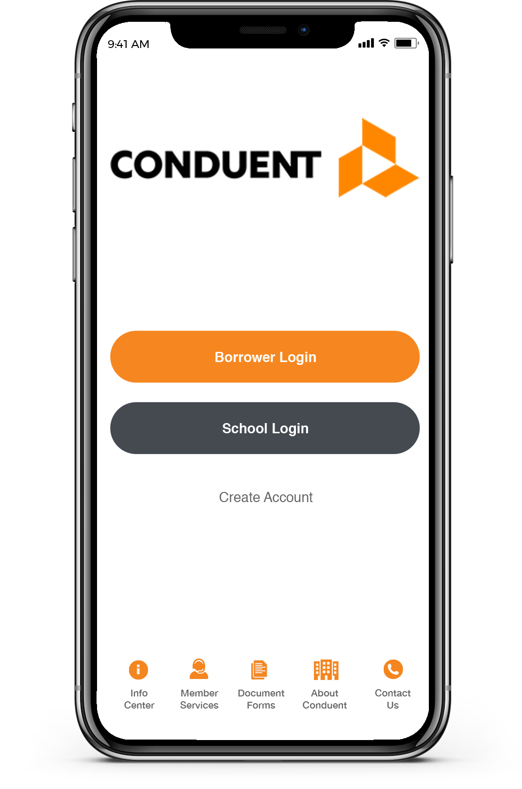
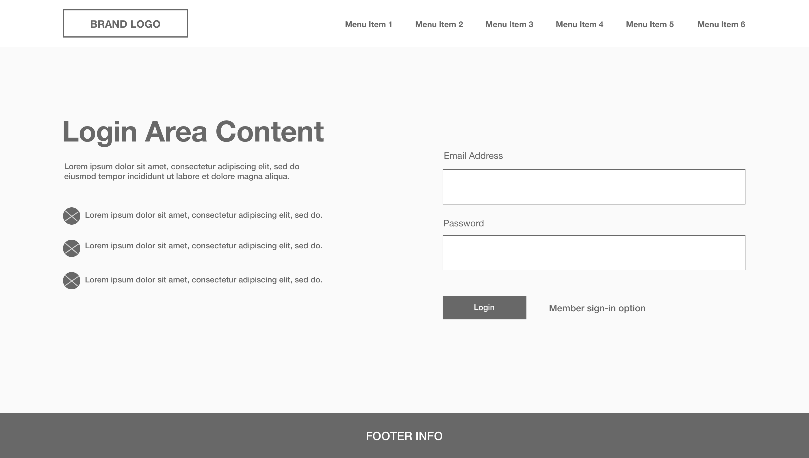
User Login Area - Wireframe Concept
Elements have been structured on a dedicated login page to focus only on key information to the user.
User Login Area - Wireframe
Elements have been structured on a dedicated login page to focus only on key information to the user.
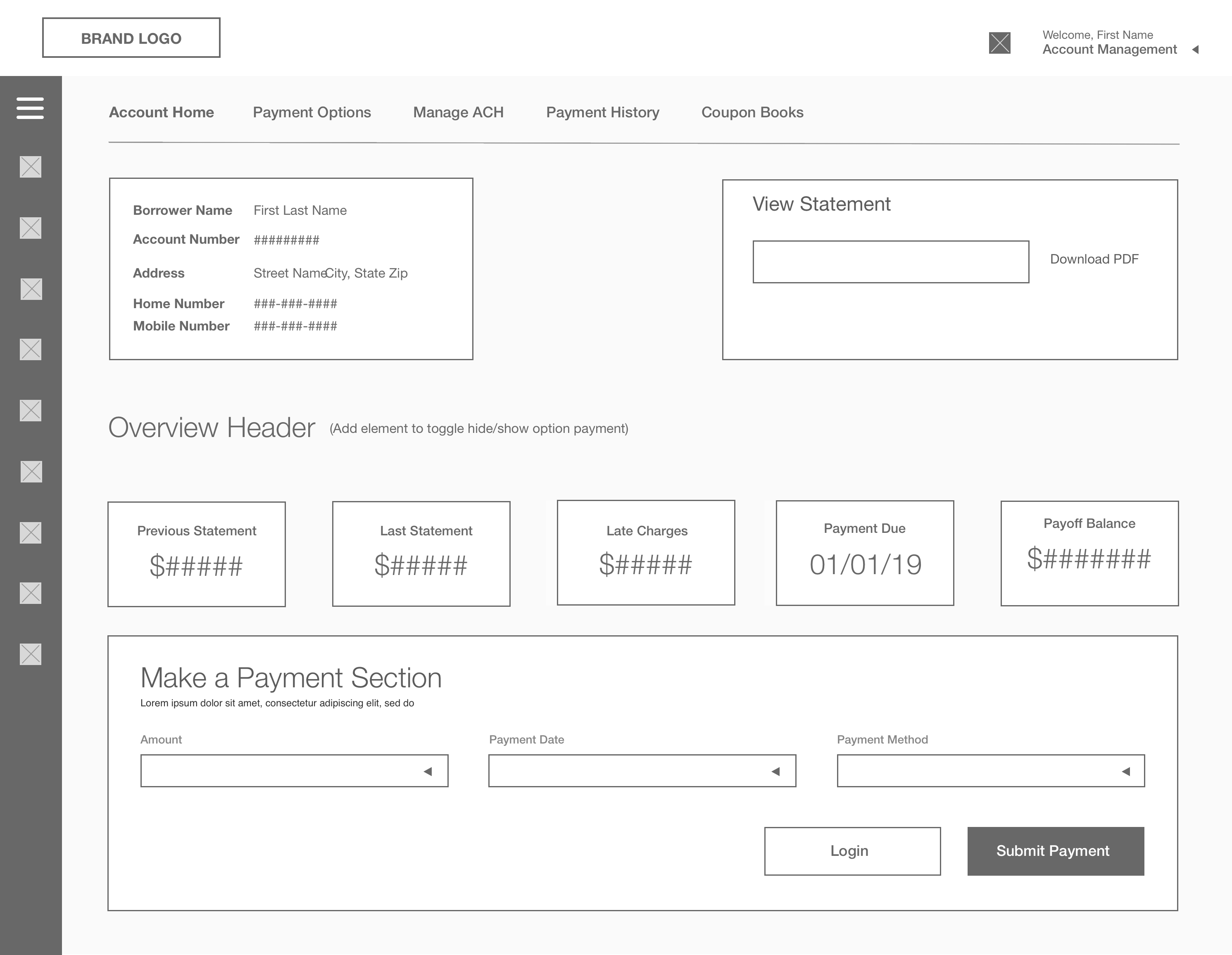
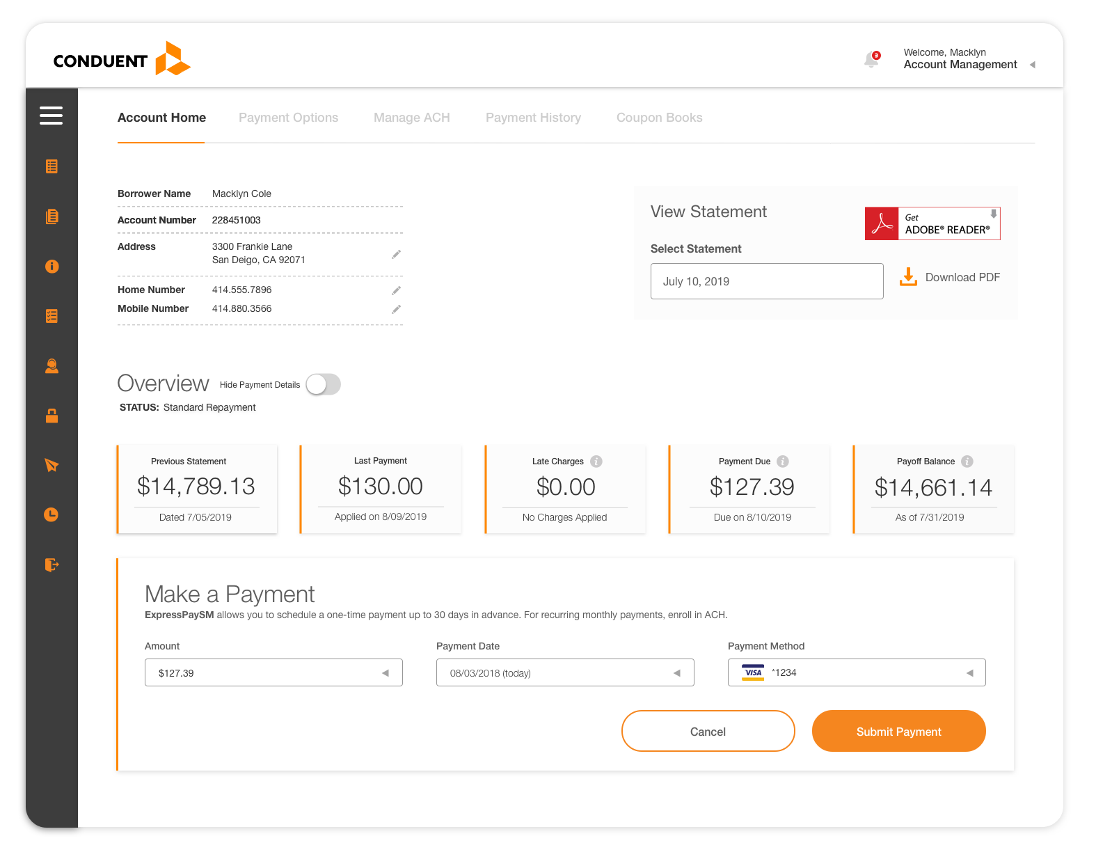
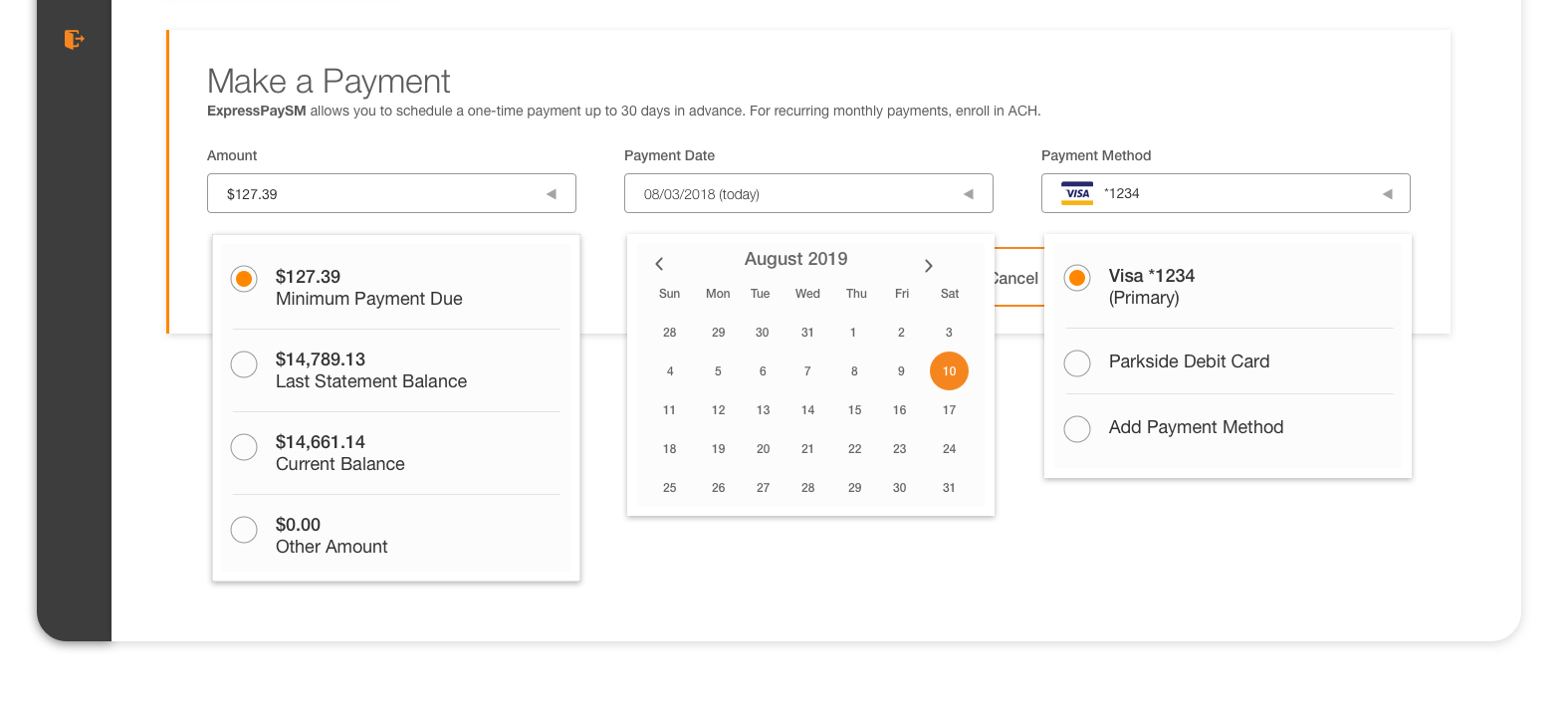
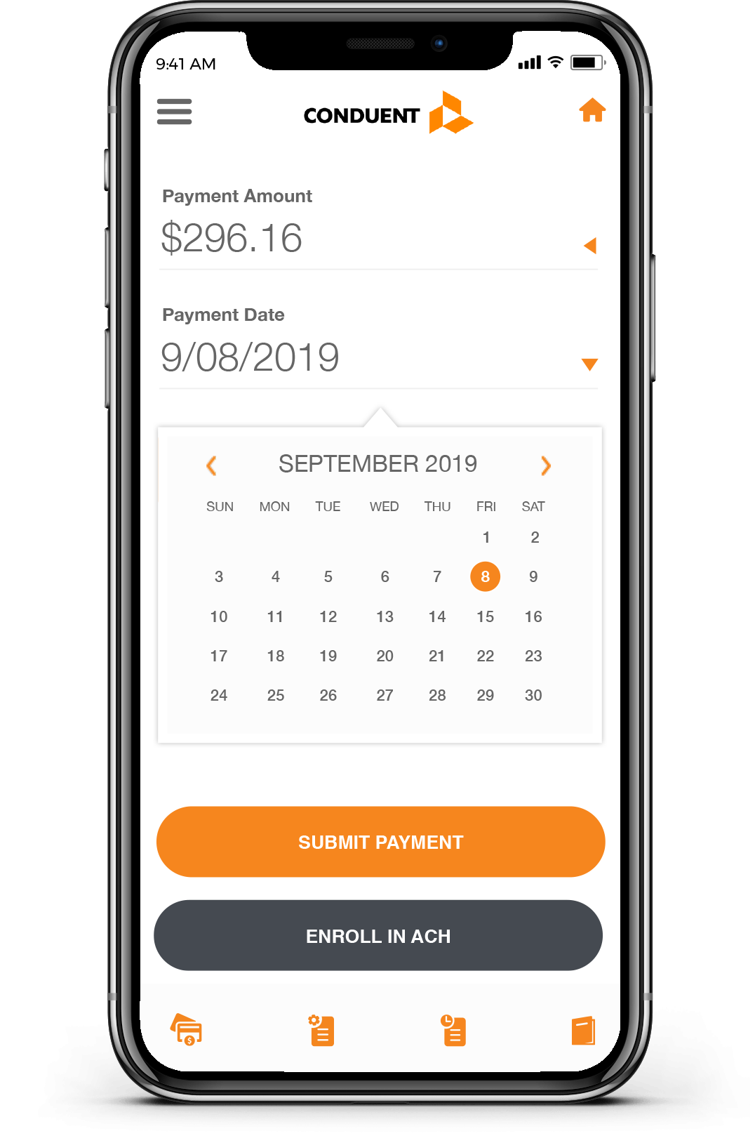
User Admin Area
For improving the user experience, I focused on the organization of the content and creating a more intuitive user interface that would allow the user to navigate easily through their account to quickly locate key information about their loan.
User Admin Area - Wireframe Concept
For improving the user experience, I focused on the organization of the content and creating a more intuitive user interface that would allow the user to navigate easily through their account to quickly locate the information that they need.