Establishing a baseline of common content standards for Bosch PROFACTOR products.
Establishing a baseline of common content standards for Bosch PROFACTOR products.
NOTE: I do not own the rights to this project. This work was created during my employment at Design Partners.
The Problem
Previously, the Bosch sales team had been dealing with concerns of inconsistent ecommerce experience for PROFACTOR products.
Previously, the Bosch sales team had been dealing with concerns of inconsistent ecommerce experience for PROFACTOR products.
The Solution
Create a product tool box kit for Bosch sales teams to use and leverage appropriately to download the correct content to be used on site as well as establish other parameters related to pre-ordering.
Create a product tool box kit for Bosch sales teams to use and leverage appropriately to download the correct content to be used on site as well as establish other parameters related to pre-ordering.
THE UX.
Think Simple. Think Intuitive.
THE UX.
Think Simple. Think Intuitive.
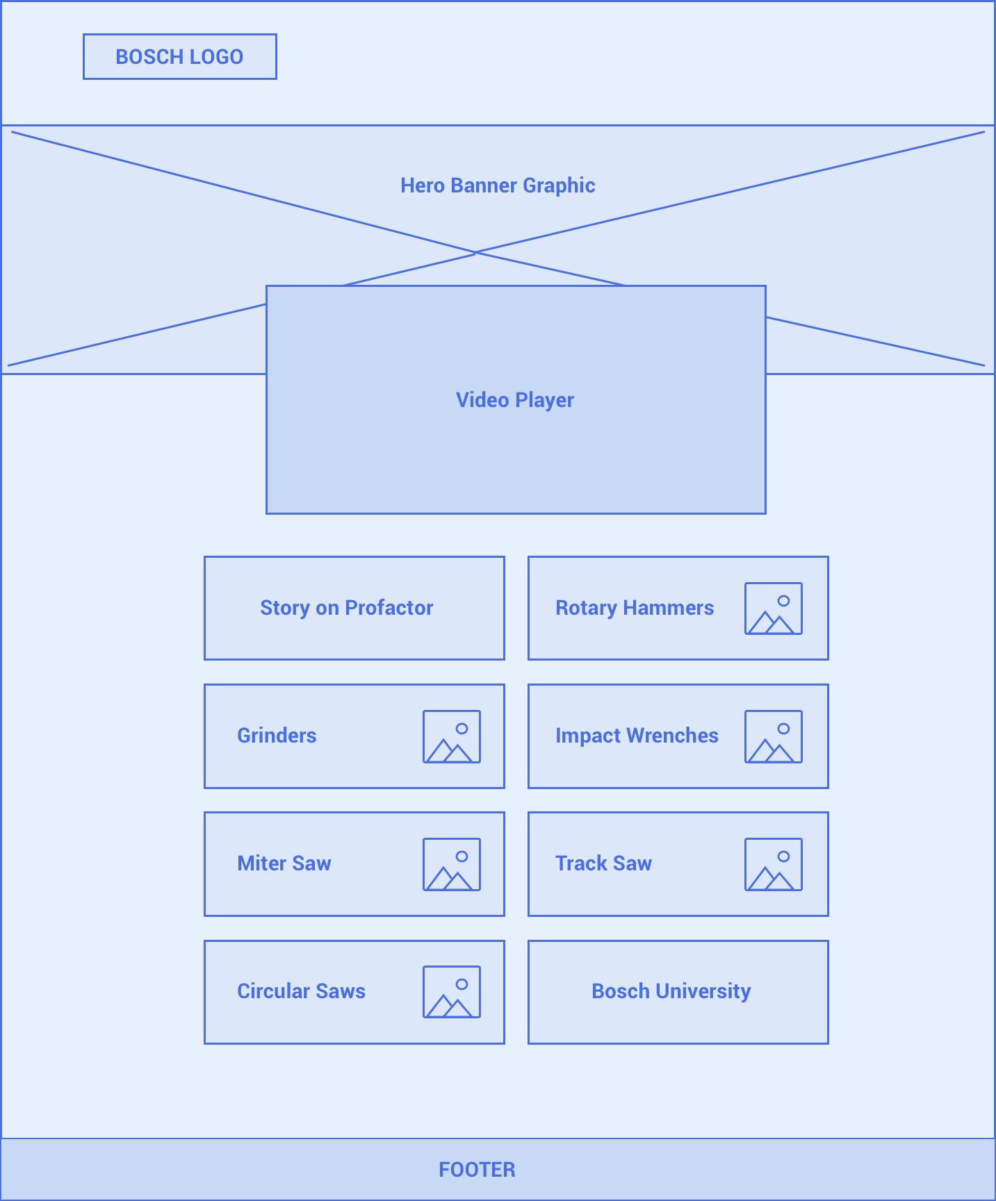
Homepage Wireframe
It was important to keep the home page simple and minimalistic. For visual aesthetics, I envisioned a large hero graphic as well as a video player for user engagement. I felt creating tile cards with product thumbnails to represent each product category would be easy to communicate to the user.
It was important to keep the home page simple and minimalistic. For visual aesthetics, I envisioned a large hero graphic as well as a video player for user engagement. I felt creating tile cards with product thumbnails to represent each product category would be easy to communicate to the user.
Toolbox Wireframe
It was important to keep the home page simple and minimalistic. For visual aesthetics, I envisioned a large hero graphic as well as a video player for user engagement. I felt creating tile cards with product thumbnails to represent each product category would be easy to communicate to the user.
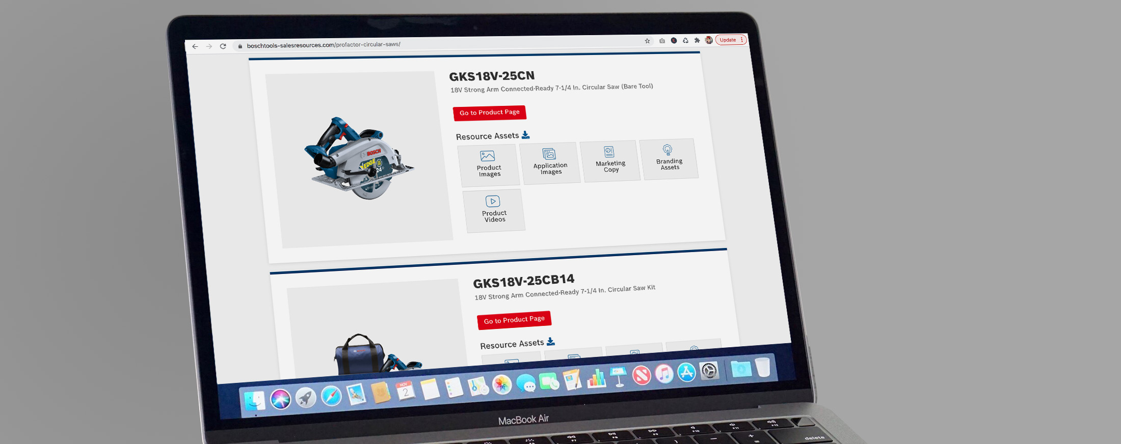
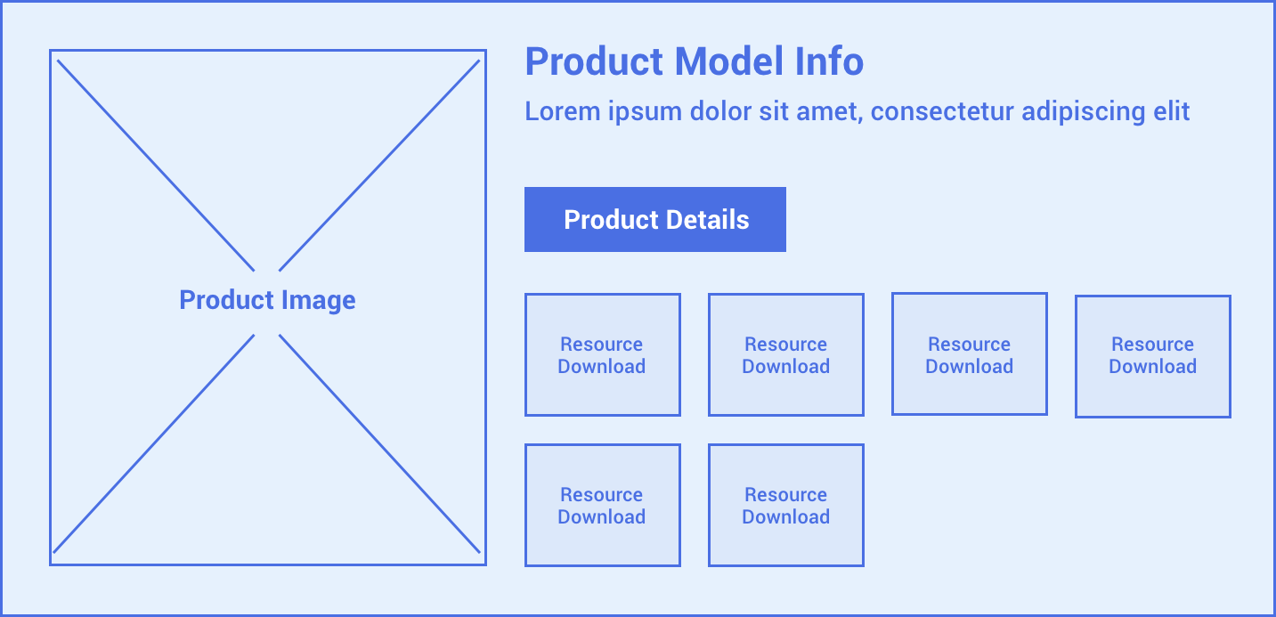
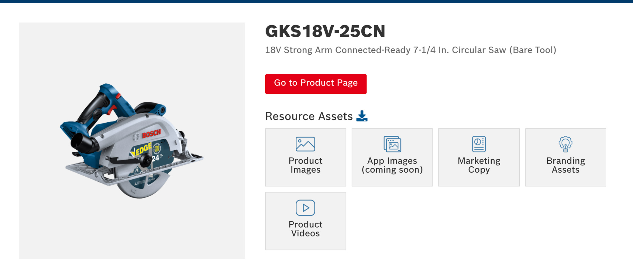
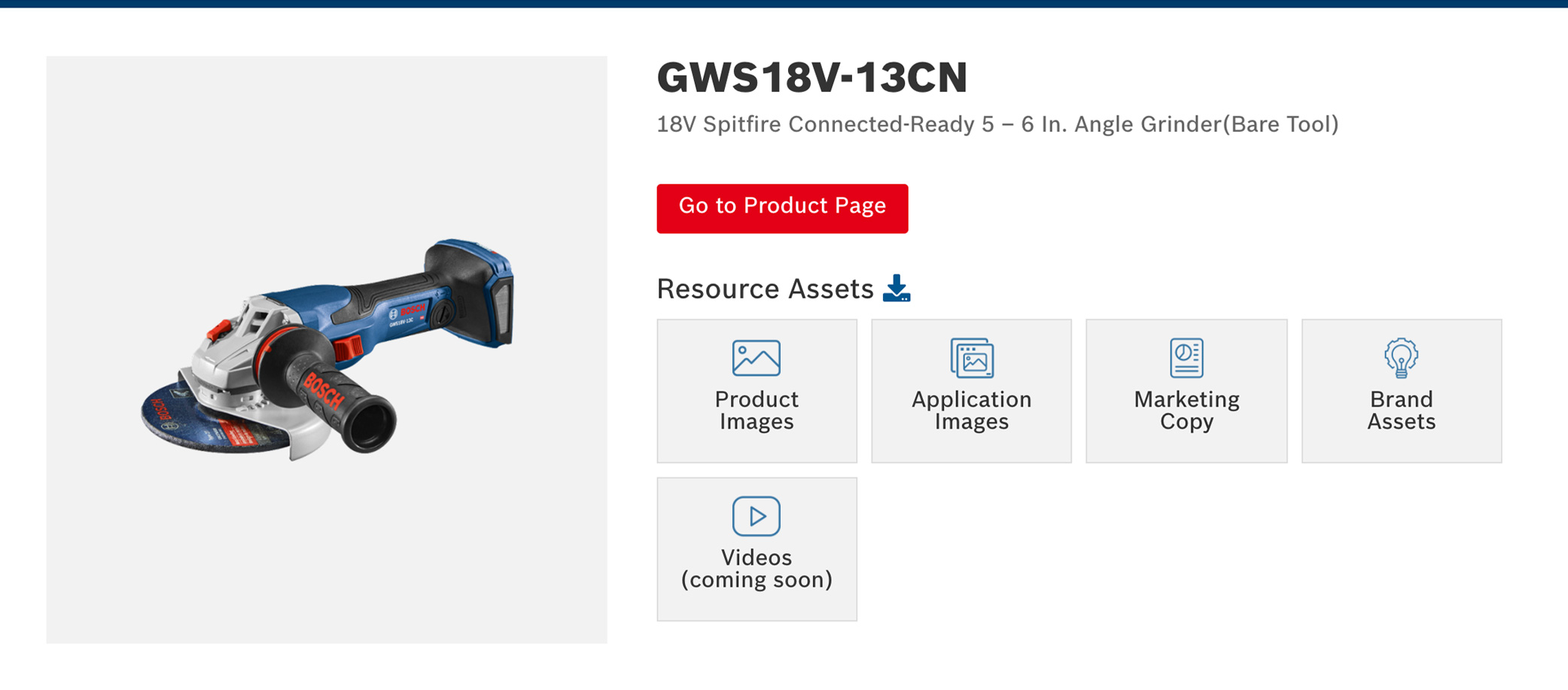
For the internal product pages, I envisioned big block card elements to display the product information that would include a large thumb image, product model information, short description, product details button and large block buttons that would include the assets via download.
THE UI.
Think Brand. Think Appeal.
THE UI.
Think Brand. Think Appeal.
Homepage UI
It was important to incorporate an attractive product hero graphic to draw the user in. Keeping the Bosch brand in mind, the Bosch deep blue pallet was used throughout ui elements on the site.
It was important to incorporate an attractive product hero graphic to draw the user in. Keeping the Bosch brand in mind, the Bosch deep blue pallet was used throughout ui elements on the site.
Toolbox Card UI
I felt the use of light grey was the right amount of balance to offset the brand colors. Icons were used on the assets to further communicate each button element.
I felt the use of light grey was the right amount of balance to offset the brand colors. Icons were used on the assets to further communicate each button element.